Designer Leemah
Designer Leemah
Designer Leemah
Own the Culture. Shape the Future.
Own the Culture. Shape the Future.
Own the Culture. Shape the Future.
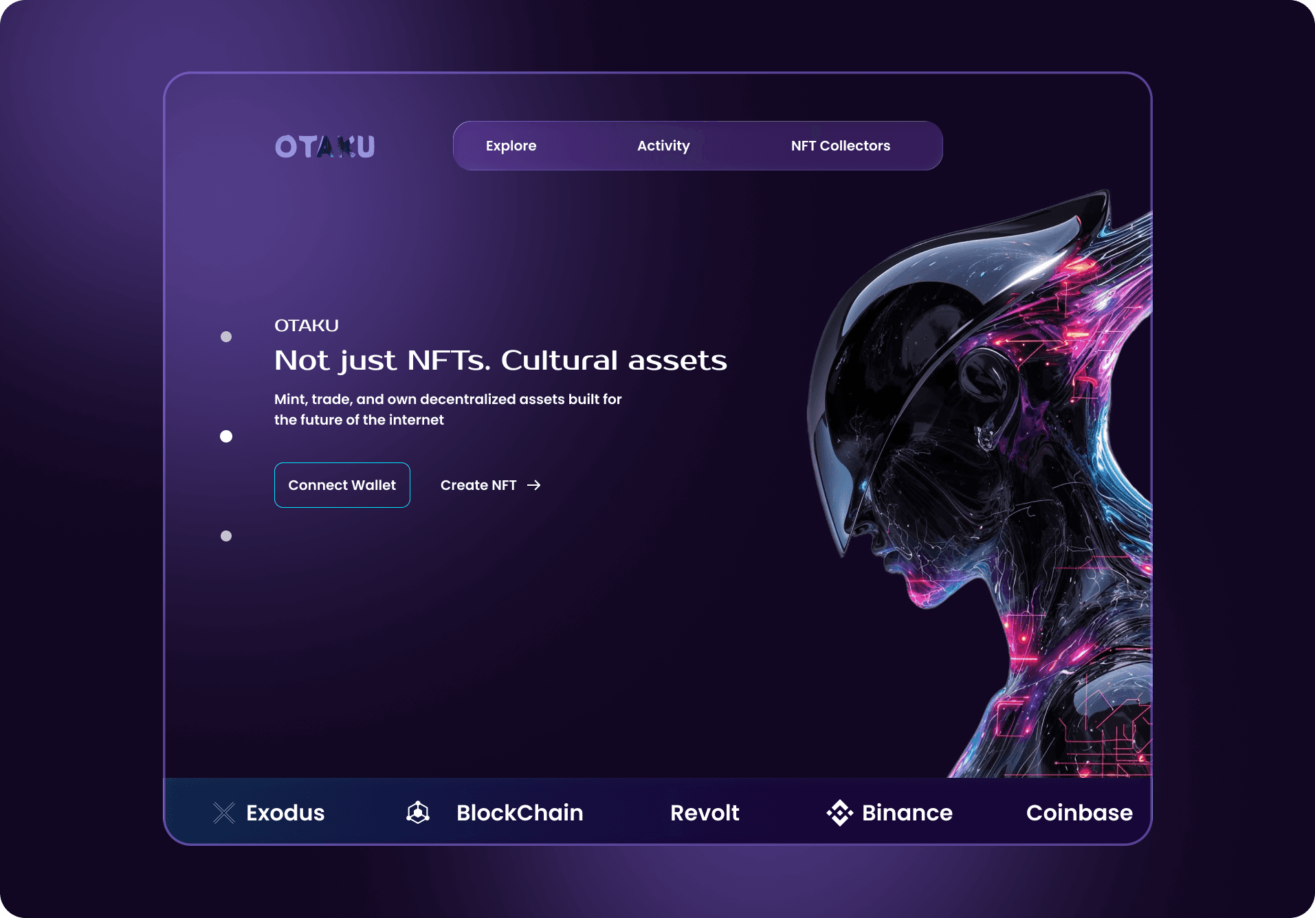
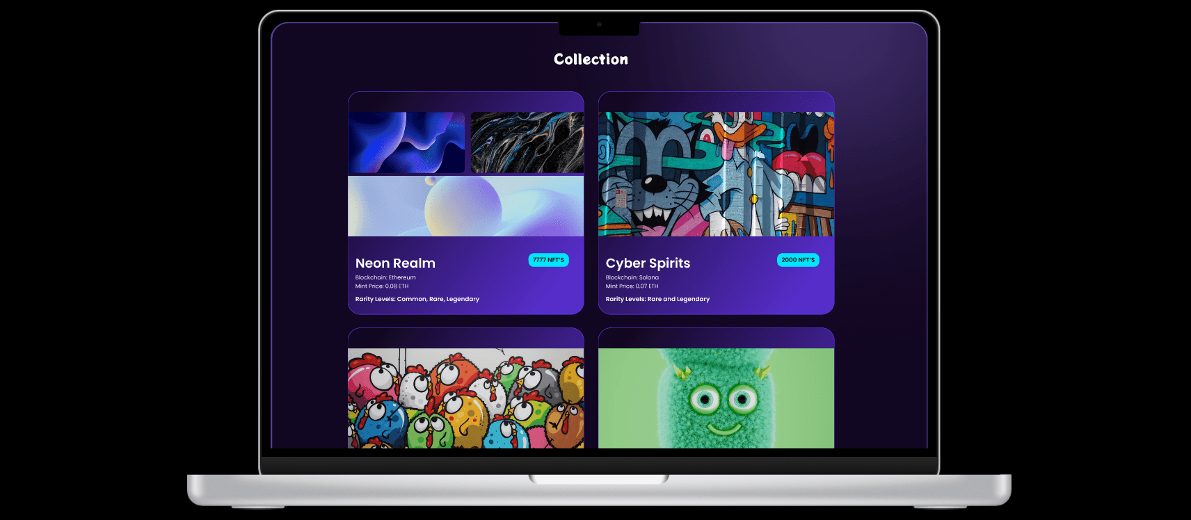
Otaku is a Web3 platform designed for minting, trading, and owning decentralized cultural assets. The goal was to create a visually immersive yet structured experience that communicates trust, community, and digital ownership beyond traditional NFTs.
This project focuses on translating cultural identity into a premium blockchain interface while maintaining usability and clarity.
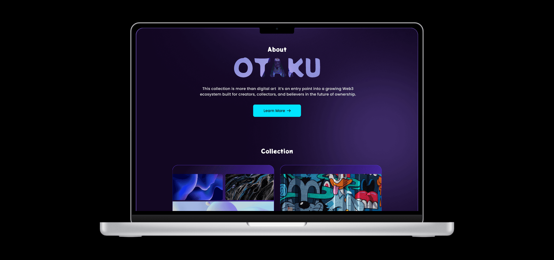
While exploring existing Web3 platforms, I noticed a pattern:
1.) Interfaces felt noisy and speculative.
2.) Visual systems lacked cohesion.
3.) Cultural storytelling was missing.
4.) New users felt overwhelmed.
5.) The problem wasn’t just usability it was positioning.
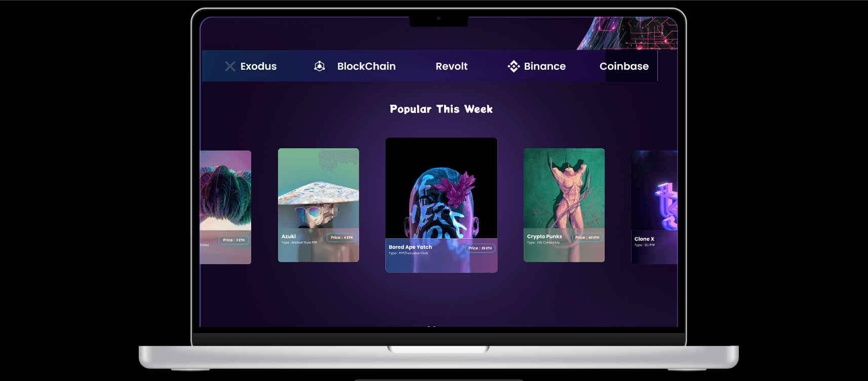
NFT platforms were selling tokens.
Otaku needed to represent culture.
While exploring existing Web3 platforms, I noticed a pattern:
1.) Interfaces felt noisy and speculative.
2.) Visual systems lacked cohesion.
3.) Cultural storytelling was missing.
4.) New users felt overwhelmed.
5.) The problem wasn’t just usability it was positioning.
NFT platforms were selling tokens.
Otaku needed to represent culture.
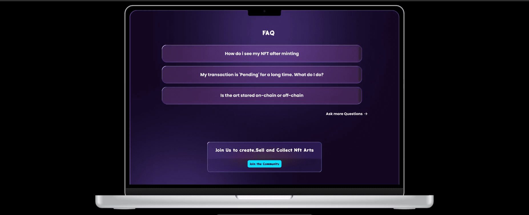
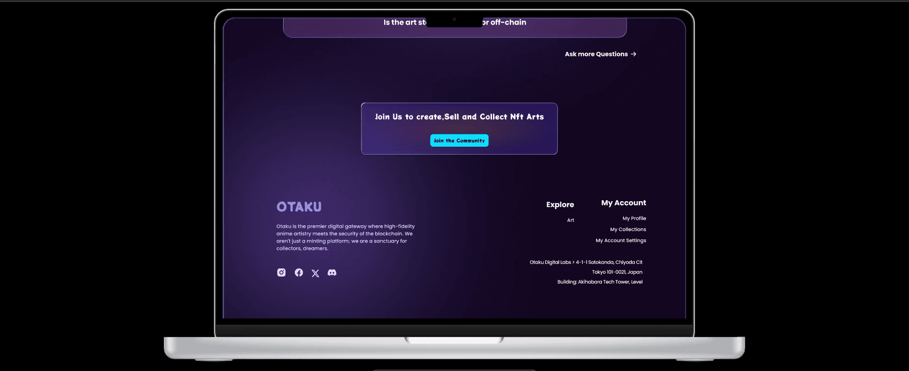
The FAQ section was intentionally designed as a calming mechanism
Instead of long explanations:
1.) Accordion structure reduces cognitive overload.
2.) Large rounded containers improve touch interaction.
3.) Consistent spacing increases readability.
4.) High contrast text ensures accessibility.
The goal was simple: Make blockchain feel less overwhelming.
More Work

More Work
Have a project in mind?